Visual system
Merchant App Visual Refresh
The PhonePe Business app needed a visual upgrade. I redesigned the in-app colour palette and creative templates for Tier 2–4 merchants: a 2.8% lift in click-through rate, better clarity, and a scalable system built on real behaviour.
Problem
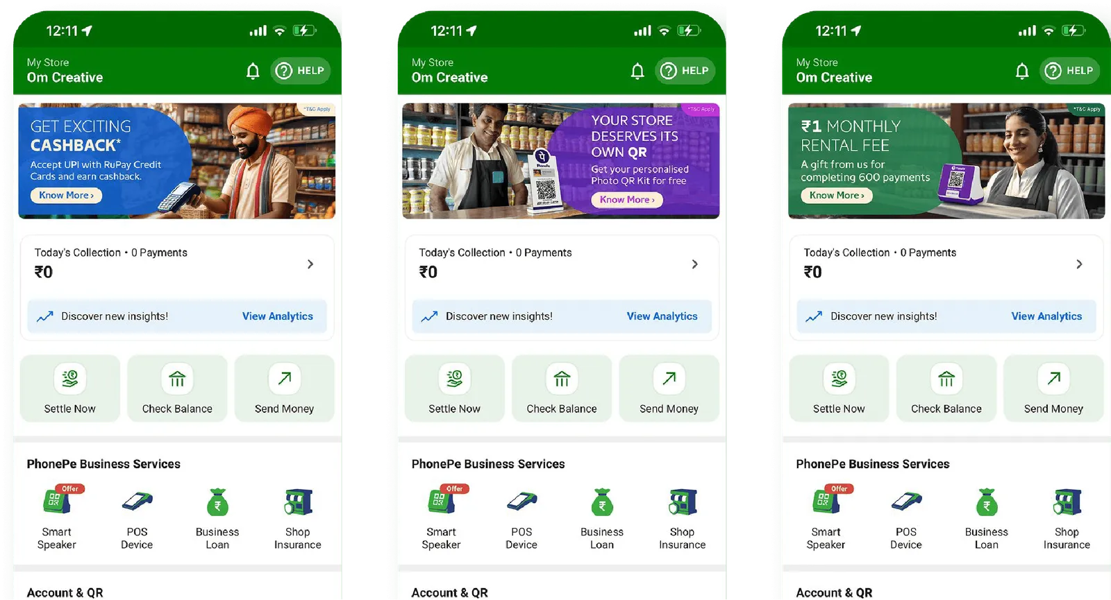
The app relied on a two-colour palette and repetitive templates, causing creative fatigue, visual blind spots and low engagement with offers.
What we learned
- Merchants engage with quick, bold visual cues
- Too much repetition = automatic skip behaviour
- Certain colour groups create subconscious trust or urgency

Competitors
User persona
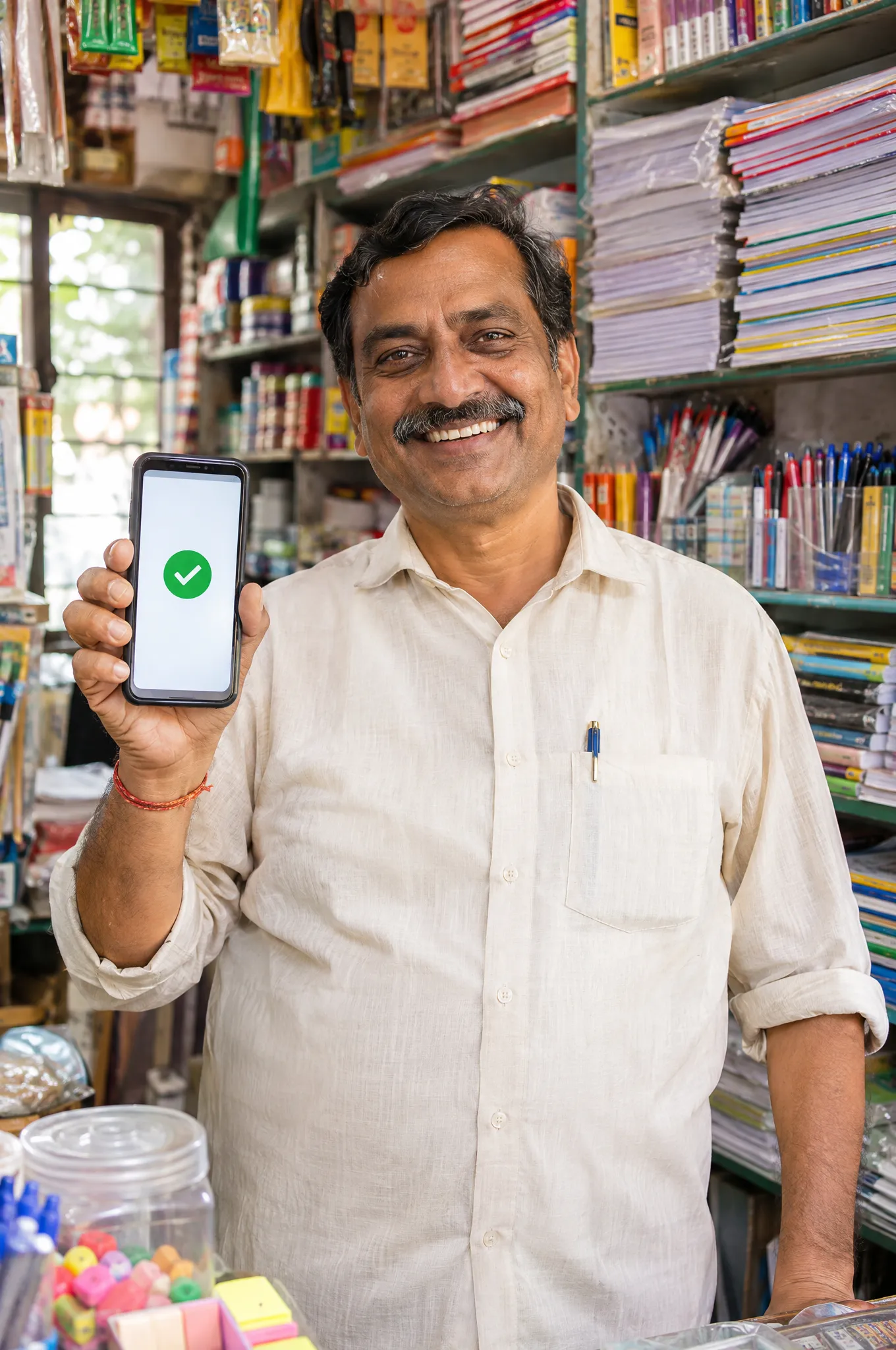
- Age 25-55, mostly male - with women-run shops emerging in urban and semi-urban areas
- Limited formal education; experience comes from running the business
- Tier 2-6 cities, towns and villages
Traits
- Use smartphones but are hesitant with advanced technology
- Focused on growing the business and keeping customers happy
- Value good customer relationships to retain loyalty
Goals
- Be seen as modern by offering seamless digital payments
- Manage finances more efficiently and save time
- Secure, hassle-free payments
System redesign
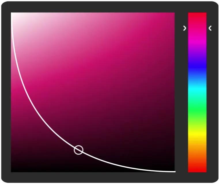
- A new palette to reduce fatigue, hold attention and vary recurring promotions
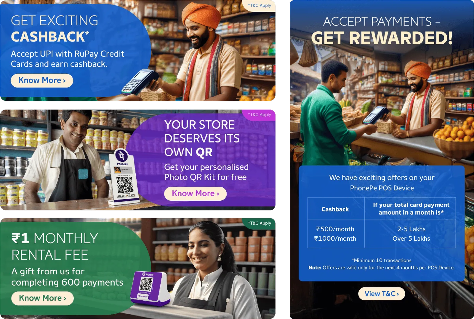
- Templates built for bold messaging, fast scanning and device constraints

Concept
Merchants prefer communication that is direct, concise and business-relevant. The creative route shows real emotion through real imagery - how the product has helped merchants grow.
Outcome
- New system launched across all merchant in-app collateral
- Click-through rate up 2.8% on merchant campaigns
- Adopted by creative and offline pods for future work
“Designing for merchants was like learning a new design dialect - rooted in speed, trust and utility.”